
FinOps Analytics – Products #
The FinOps Analytics by Products Dashboard consolidates various data to generate an executive view of consolidated costs in a single analysis panel. From it, you can track the total consolidated cost, daily average, monthly projections, variations compared to the previous period, and the distribution of spending by service. This approach transforms raw billing data into actionable insights, supporting decisions and increasing financial efficiency and governance.
FinOps Analytics – Tags / RGs / Labels #
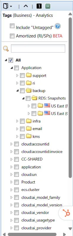
The FinOps Analytics by Tags / RGs / Labels Dashboard consolidates various data to generate an executive view of consolidated costs in a single analysis panel. The difference stems from the option to filter costs not by product category, but by Tags. You can filter tags by both key and value, bringing increasingly higher levels of detail. Filtering is performed via the right side menu.
Understanding FinOps Analytics Dashboards #
Consolidated Dashboard #

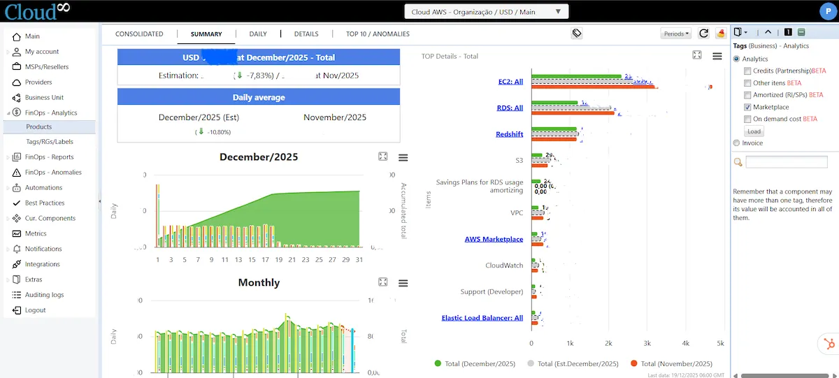
The consolidated dashboard provides a general overview of costs, featuring an annual view and a monthly comparison. In the right side menu, you can apply various filters, including cost amortization, credits, and marketplace costs, if you adopt the Analytics view. By selecting “Invoice”, costs will be displayed as shown in the invoice sent by the cloud provider to the customer.
Summary Dashboard #
It provides a consolidated view of the last 12 months, in addition to a daily cost view. Besides comparing costs from the current period to the previous one, this dashboard also presents Top Details—the services with the highest cost in the environment, their current value, and the value from the previous period.
Daily Dashboard #
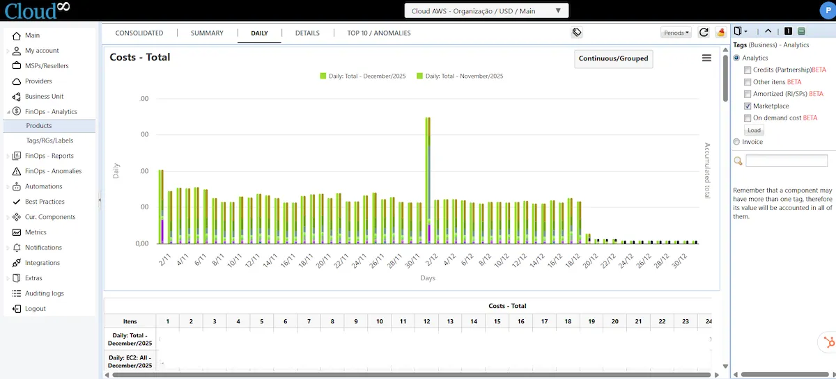
Detailed view of daily costs by service category.
Details Dashboard #
This dashboard presents a detailed view of costs, allowing you to analyze each consumption component individually, as well as its absolute and percentage variation between periods. The hierarchical structure by service (such as EC2, RDS, Redshift, S3, and Marketplace) makes it possible to quickly identify the main cost drivers, distinguish billing models (On-Demand, Spot, Savings Plans, Storage, Backup, Data Transfer), and understand the impact of each metric on the total consolidated amount.
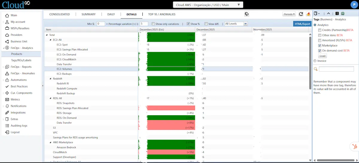
You can configure a series of filters to evaluate cost variations:
- Min $: filter only consumption lines whose variation compared to the previous period is greater than or equal to the entered value.
- Percentage variation (+/-): filter only consumption lines whose variation compared to the previous period is greater than or equal to the entered percentage.
- Show only variations: if checked, the dashboard will display only the lines where a cost variation occurred. If not selected, all consumption lines, including those without variation, will be displayed.
- Show % : if checked, the percentage variation will be displayed next to the value.
- View diff.: if checked, the difference in values between the periods will be displayed.
- Levels: the level of detail for the information. The higher the level, the more cost detail levels are displayed.

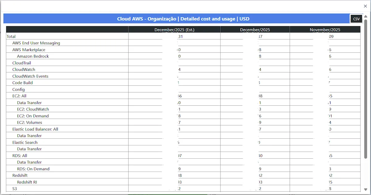
You can also export the generated data by clicking “HTML/Export”. Then, click the “CSV” button.
Top 10 / Anomalies #
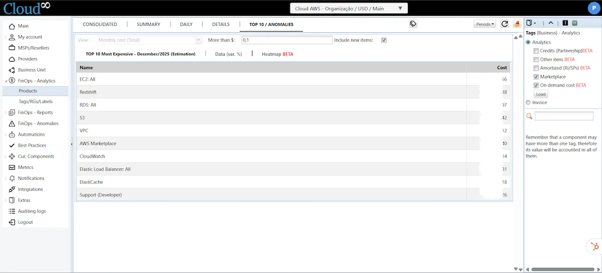
Top 10 Most Expensive – Estimate #
This dashboard displays the top 10 most expensive service categories projected for the period. When referring to a month that has not yet closed, the information presented is only an estimate based on the Forecast for the period.
Data (var %) #
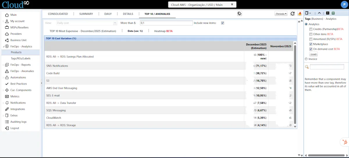
This dashboard presents the top 10 offenders based on cost percentage variation. This is a summary view that allows for quick identification of offenders.
Heatmap #
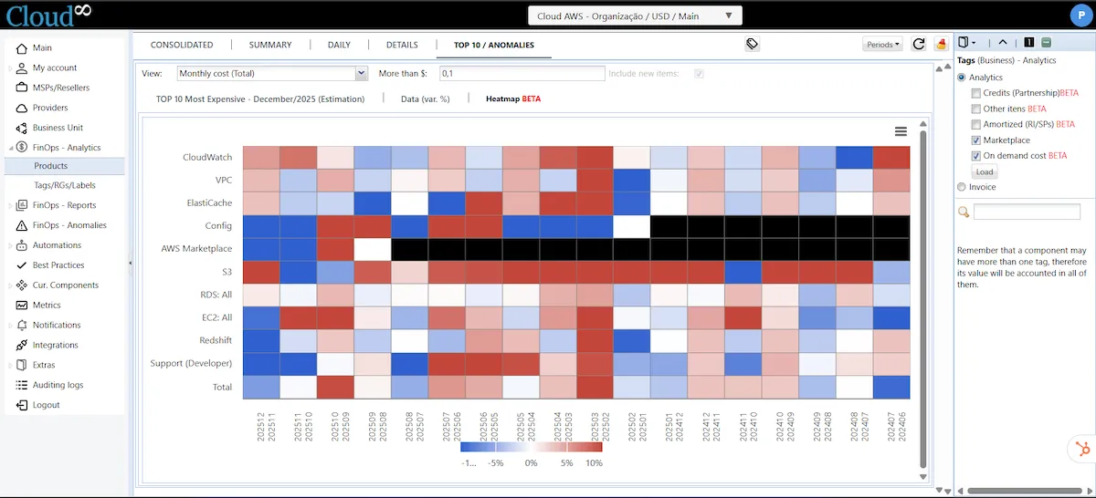
The heatmap is an analytical visualization that facilitates the quick identification of cost variations over time, highlighting trends, spikes, and anomalous behaviors without the need to analyze numbers line by line.
How to read this dashboard heatmap:
- Rows: represent services or cost groupings.
- Columns: represent periods, organized chronologically.
- Colors: indicate the percentage cost variation relative to the previous period:
- Shades of red → cost increase (the more intense, the greater the increase).
- Shades of blue → cost reduction.
- Light / white shades → stability or variation close to zero.
- Black → no cost or data not applicable for that period.
What this heatmap allows you to identify:
- Services with recurring cost growth, when they appear with multiple consecutive red blocks.
- Effects of optimizations or architectural changes, visible as transitions from red to blue.
- Financial anomalies, when there is an isolated intense red in a specific month.
- Seasonality, by observing patterns that repeat in certain periods.
- Impact on total cost, by comparing the “Total” row with individual services.
Conclusion #
The FinOps Analytics dashboards consolidate complex billing data into clear views to support decision-making, allowing technical, financial, and business areas to share a unified understanding of cloud costs. By combining analyses by Products and by Tags / RGs / Labels, the platform enables both a macro view of consumption and granular detailing by responsibility, application, or cost center.
Thus, FinOps Analytics ceases to be merely a reporting tool and acts as a strategic instrument of financial governance, supporting cost control practices, budget predictability, accountability, and continuous improvement of cloud efficiency.


