
Overview #
The ability to visualize accurate cost data and generate reports is one of the pillars of a successful FinOps practice. Multicloud environments become difficult to manage because data comes from multiple sources with heterogeneous column names for the same information. Cost data analysis often requires complex data normalization work to generate a minimally functional report.
In Cloud8, we allow users to have full control over filters and the display of their cost data through the “Dashboards” feature. Through it, you can filter, display, and export information using a pivot table with data exported directly from the cloud service provider. Thus, the end user is solely responsible for determining which information will be displayed.
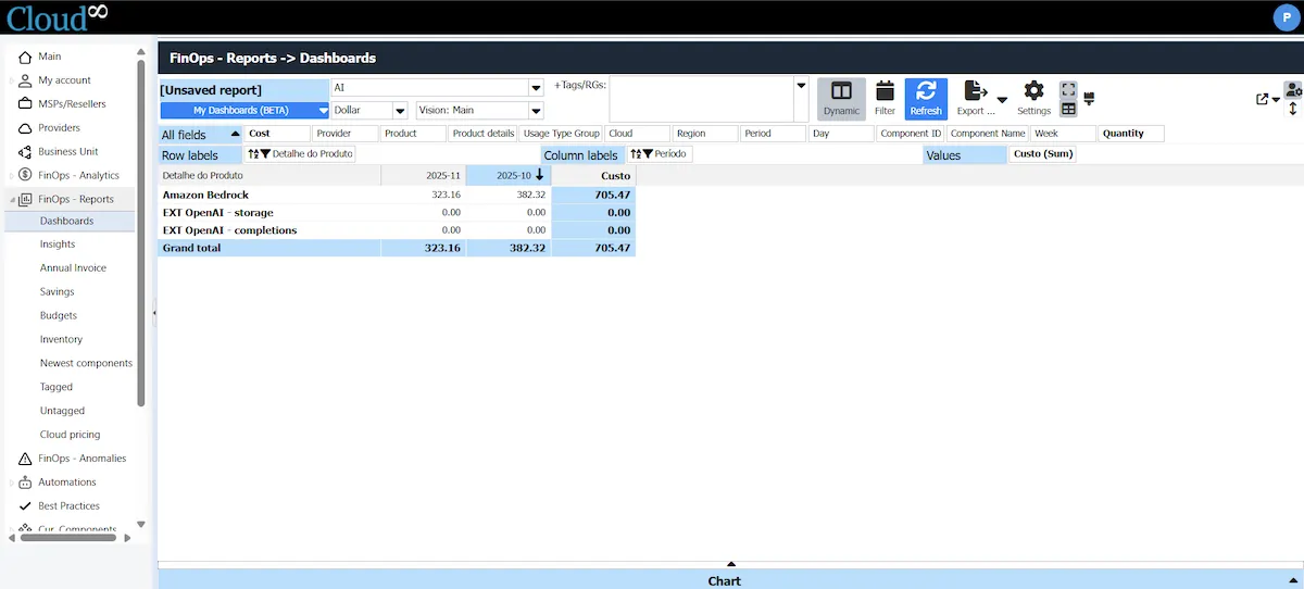
By clicking on “FinOps – Reports” in the left sidebar, an expander will display several features, including “Dashboards“. Clicking it will give the user access to a pivot table directly integrated with the providers registered in the Cloud8 system.
Understanding the Dashboards interface #
Dashboards was designed to allow users to manipulate data through a Drag-and-Drop system, eliminating the need to memorize or use any query systems such as SQL, KQL, and the like. Blocks can be selected and rearranged according to the user’s needs.
This system allows data to be manipulated by both technical users and other user profiles, such as executives and finance teams, to provide visibility into costs tied to previously defined business units and rules without requiring knowledge of query languages. The system uses the following options:
All Fields #
Displays all widgets that can be used to generate pivot tables.
- Cost: cost information;
- Provider: providers registered in the Cloud8 system;
- Product: the type of product (Virtual Machines, EKS, Redis, etc.);
- Product details: the type of billing linked to a resource (Storage, Data Transfer, etc.);
- Usage type group: information such as resource SKUs;
- Region: resource region;
- Component ID: resource ID;
- Component name: resource name.
Row labels and Column labels #
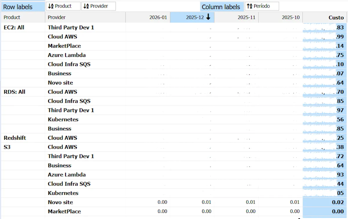
Through the Drag-and-Drop system, widgets dragged from All Fields to Row and Column will be displayed respectively as a row or column in the pivot table. The display order of the information follows the order of the blocks from left to right. In the example below, a visualization was generated based on the product type, displaying the costs for each provider.
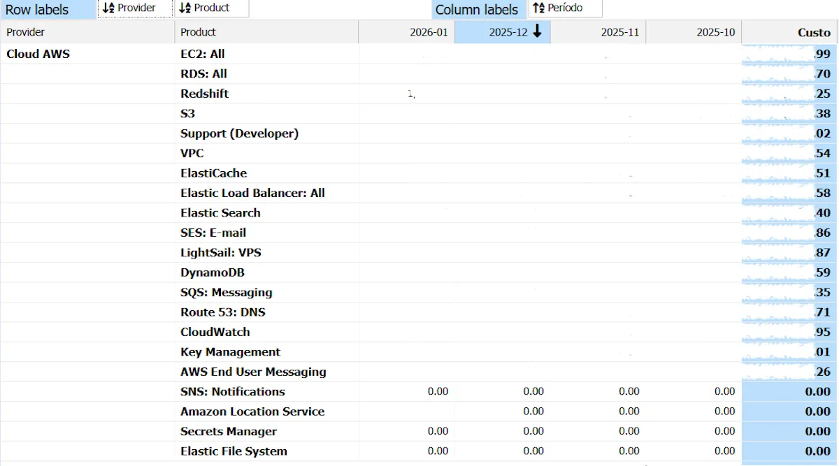
If the user wishes to organize costs by provider and display costs for each product type, simply drag the “Provider” block in front of the “Product” block.
Values #
Through the Drag-and-Drop system, widgets dragged from All Fields to Values will be displayed in a value column, which can be configured to show the sum or count. To change the configuration, click on the widget and select “Field settings“
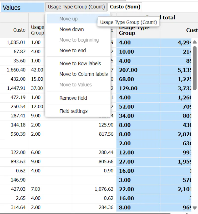
Under “Summarize by“, select “Count” or “Sum“. Then click “OK”.
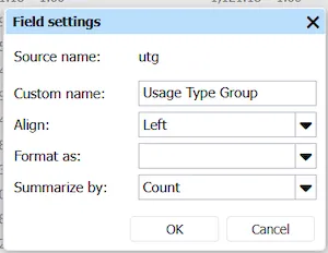
Chart #
The data selected in Dashboards can be viewed in chart format by clicking “Chart” at the bottom of the screen.
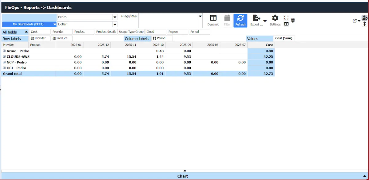
Charts can be configured by clicking “Series Type“, allowing you to choose from the options below:
- Column
- Stacked Column
- Bar
- Stacked Bar
- Line
- Area
- Bubble
- Scatter
- Pie
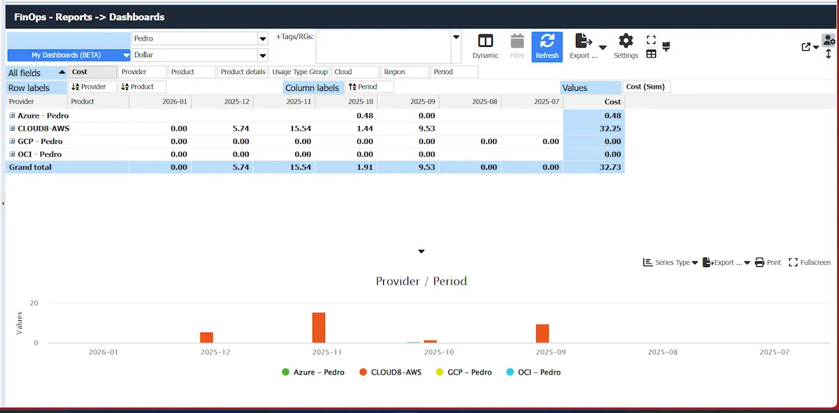
It is also possible to export the chart by clicking the Export option, and print it by clicking “Print“. Finally, you can expand the chart to analyze it in more detail by clicking “Fullscreen“.
Filters and additional options #
At the top of the screen, there are various filters and additional options that help improve performance when using the Dashboards panel. These options allow you to select data loading scopes based on registered Providers and even Tags configured in the environment.

1 – Provider Selector: allows you to select a Provider or Business Unit to load data into the Dashboards.
2 – Currency: allows you to select the currency in which values will be displayed on the panel.
3 – +Tags / RGs: allows you to select Tags and Resource Groups as filters when generating the Dashboard.
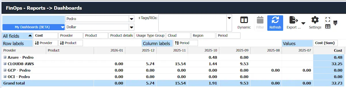
4 – Dynamic: selecting this option causes data to load automatically as soon as a widget is dragged to a specific position, without needing to click “Refresh“. In addition, this option enables the following filter options:
- Day: daily cost view.
- Component ID: resource ID.
- Component Name: resource name.
- Week: weekly cost view.
- Quantity: number of cataloged elements according to an applied filter.

5 – Filter: this option remains disabled outside of “Dynamic” mode. It allows you to select a specific time period.
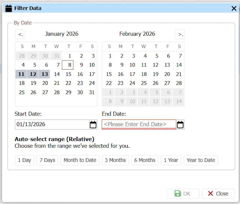
6 – Refresh: reloads data manually to apply field or filter changes. Although Dynamic mode performs loading automatically, the user can also trigger this action manually.
7 – Export: Allows you to export data in various formats for use in third-party tools.
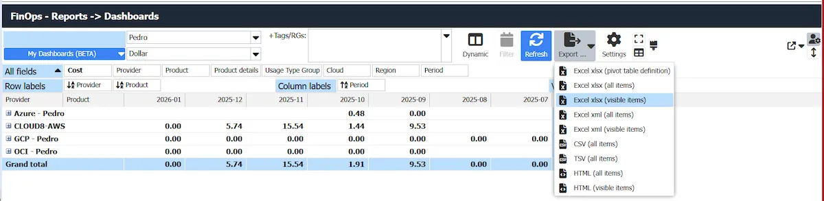
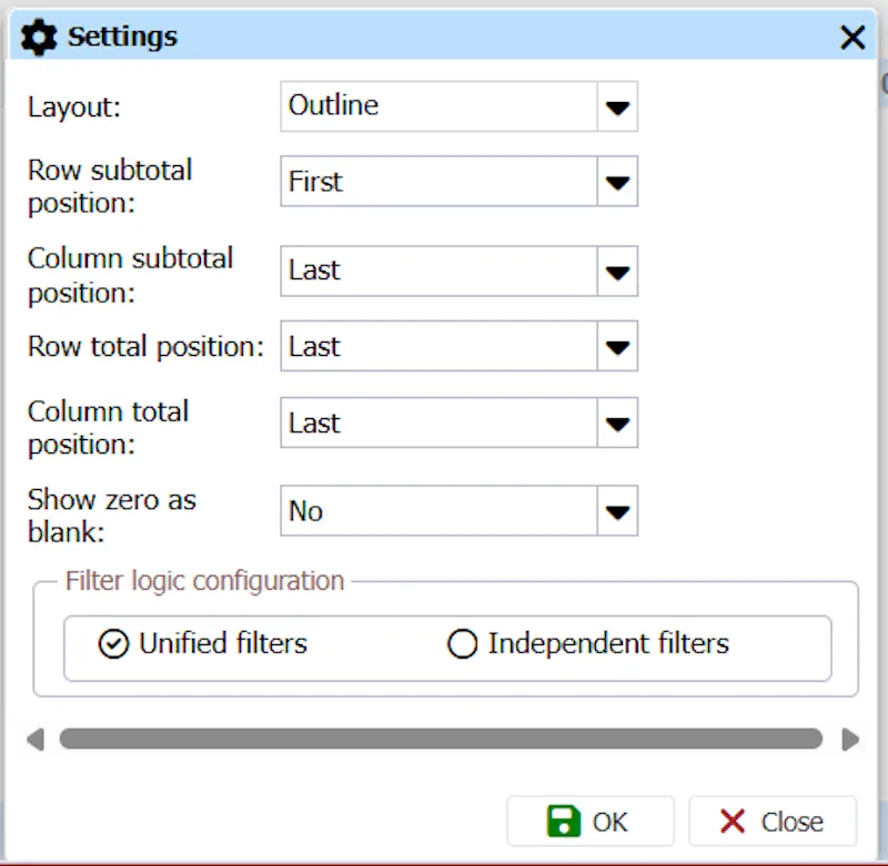
8 – Settings: Allows you to configure data display options, such as pivot table format, and row/column positioning.
9 – Expand All: by default, information in the Dashboards pivot table is displayed in a collapsed state.

If the user wishes to expand a field to see more details, they should click the “+” icon next to the field name, as in the example above. If the user wants to see the product costs for a specific Provider, they must expand the row view.

The “Expand All” option allows the user to expand the view of all rows at once.
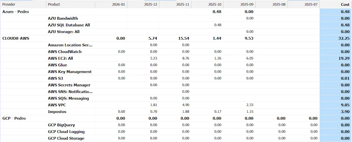
10 – Tabular View: allows data to be viewed in a table format. In practice, the values displayed will only be those of the last applied filter.
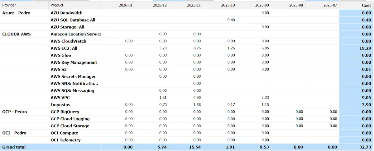
Compare the result above with the one generated by the “Expand All” option. In “Tabular View“, only the sum of the last “Product” filter is displayed, maintaining focus on cost by product. In contrast, “Expand All” displays both the total cost per Provider and the total cost per Product in separate rows.
11 – Reset: used to clear all applied filters and configurations, returning the data to its original view.
Configuring Dashboards for future queries #
Cloud8 allows a created Dashboard view to be saved for future queries. In scenarios with multiple business units, teams, or even to ensure that users with different profiles (Finance, Technical, Executive, etc.) see only the data relevant to them, generated Dashboards can be saved for future consultation without needing to reconfigure all applied fields and filters.
After configuring the desired data display, click “My Dashboards” in the upper-left corner of the panel. Select “Save New“.
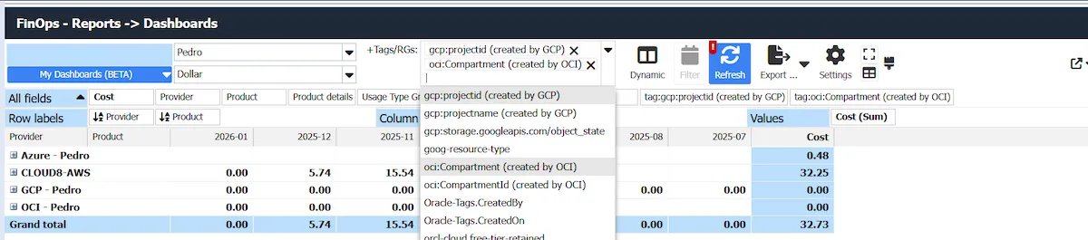
On the next screen, give the created Dashboard a name and check the “Share with all users” checkbox if you want the saved panel to also be visible to other Cloud8 users.
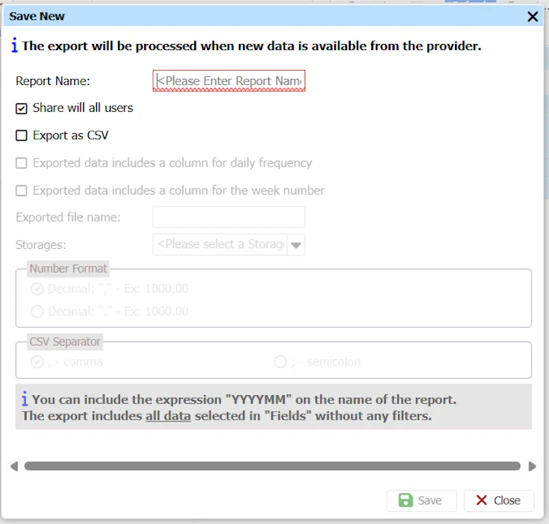
You can export the Dashboards result in CSV format to a storage service, such as Blob Storage (Azure), Bucket S3 (AWS), and BigQuery (GCP). Simply select the “Export as CSV” option.
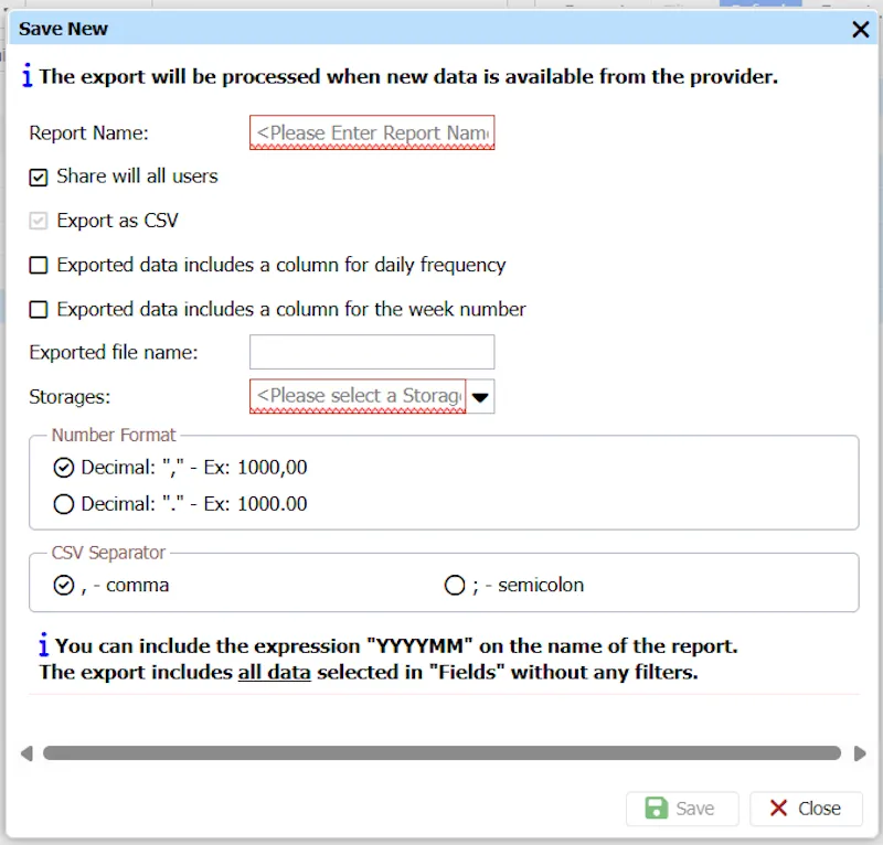
You can choose options to include a column for daily frequency and one for the week number by checking their respective boxes. Give the exported file a name and select the Storage where the file will be saved.
NOTE: Storage configuration is done under Integrations in the left sidebar.
Select the decimal place format, the CSV separator, and then click “Save“. Once configured, saved dashboards will automatically be exported to the selected Storage, allowing the user to integrate this data with BI tools and the like.


